

Book Jacket Re-Design
A Process Study
What’s the problem?


James Michener was an American author. He wrote 40 long books about fictional family sagas covering the lives of many generations in particular geographic locales and incorporating detailed facts about history. These are among New York Times best sellers and are translated to many languages.
However, each book cover is different, lacking in excitement or connection to the lively characters and other books in the series. They blend in on shelves and are difficult to find.
my solution:
The end solution needs to be three cohesive, bold, recognizable covers that make viewers desire to discover the mysteries within. My approach will do this through modern studio portraiture. I decided to craft confrontational portraits that capture the realness of the characters and have a modern twist of personifying each geographical location. Rather than relying on images that already exist, I sourced specific models, props, and studio photography equipment to create new images for each cover.
forming the vision

Criteria includes dramatic, dark, modern portraiture, alluring, captivating. I researched covers and images that were well executed and inspired my final creations.
Final Portraits
-

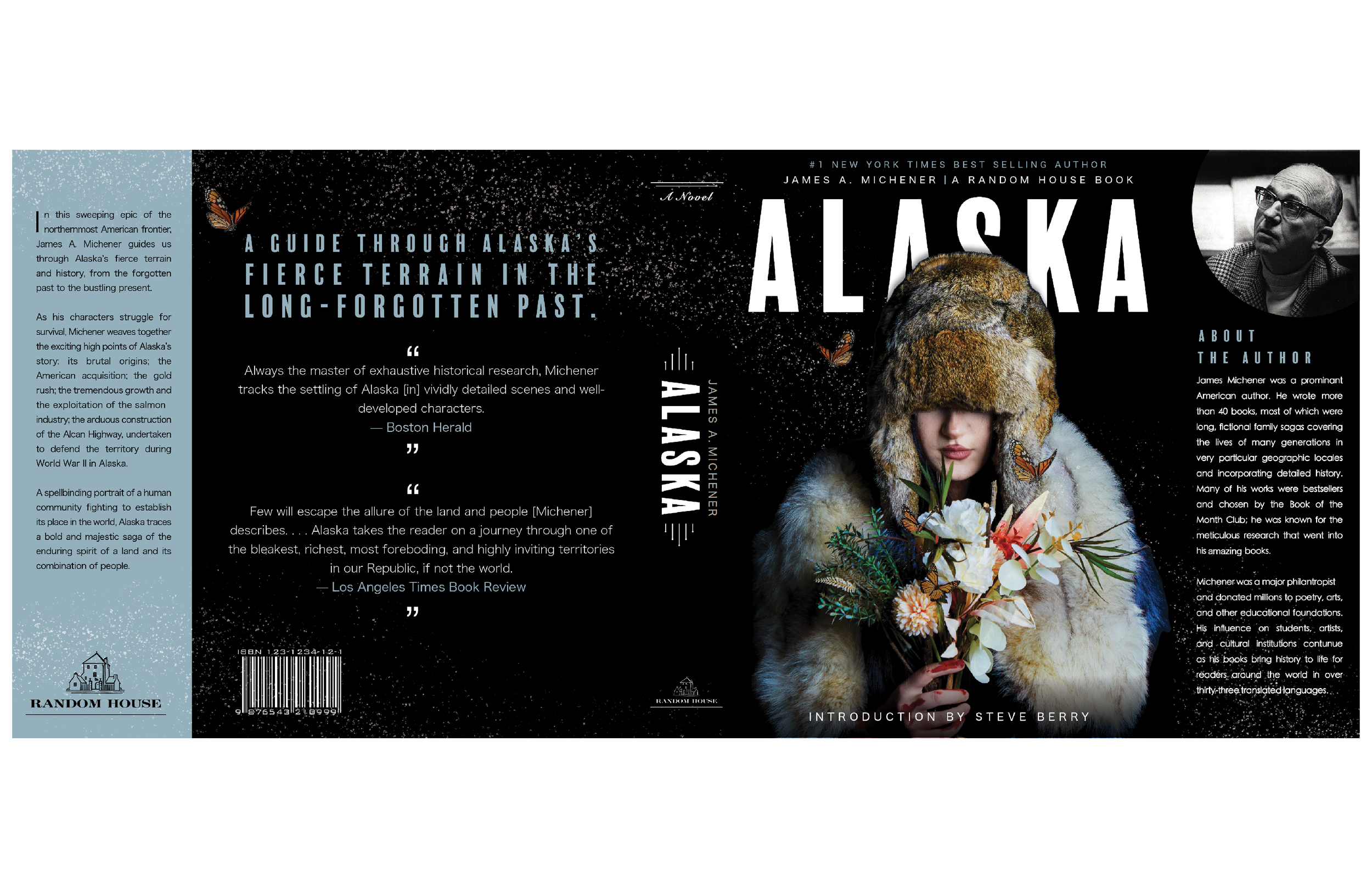
FINAL COVER IMAGE 1
ALASKA
The book covers Alaska’s brutal origins, the American acquisition, tthe gold rush, the exploitation of the salmon industry, the construction of Alcan Highway, as Alaska defends its territory during World War II.
-

FINAL COVER IMAGE 2
COVENANT
An epic tale about the San tribal customs in South Africa. Covenant novel highlights themes such as exploita-tion of land and people as well as Catholocism vs Calvanism.
-

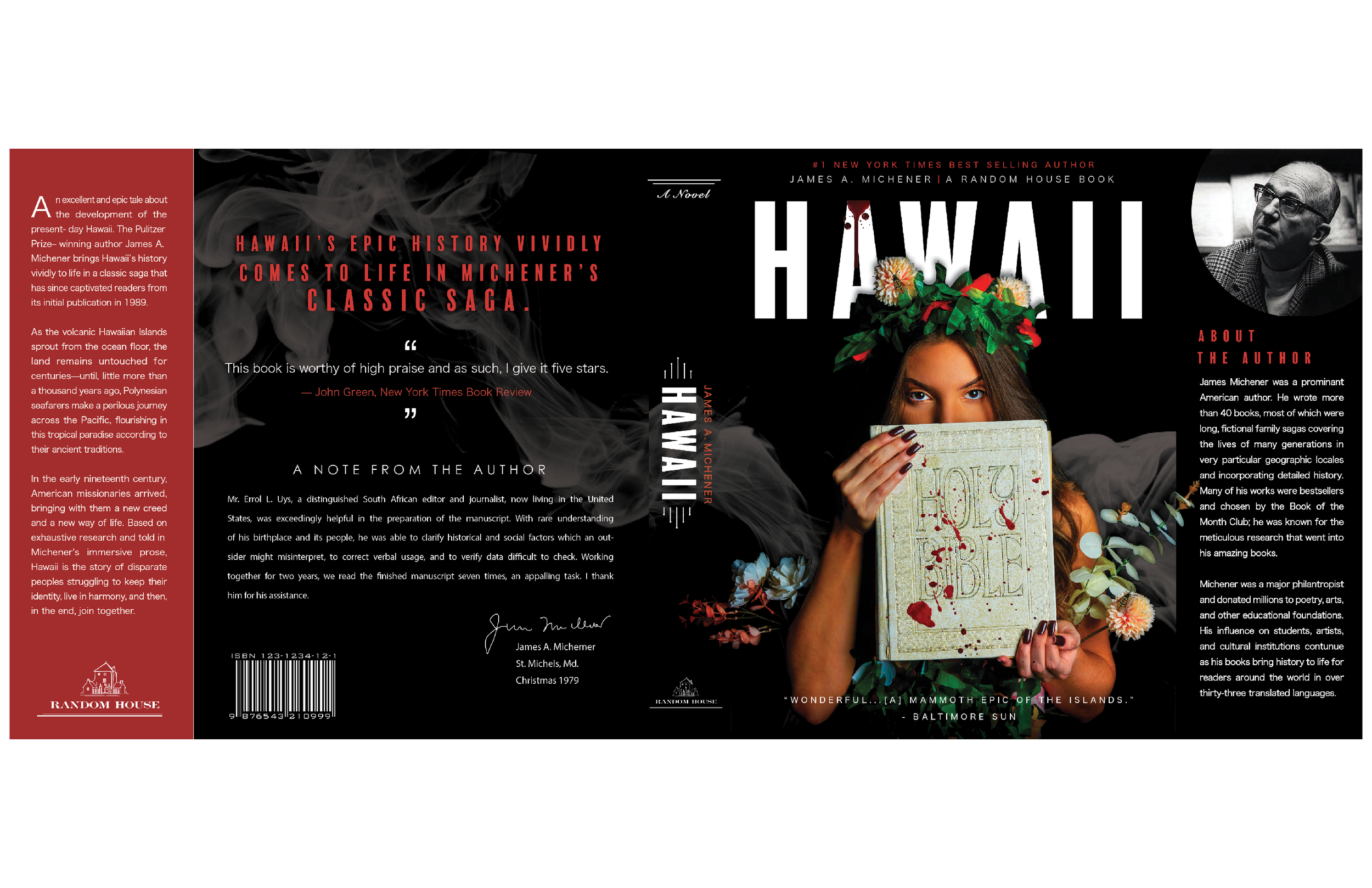
FINAL COVER IMAGE
HAWAII
Covers 11 missionary families travel to Hawaii where they work to convert the ruling family, the history of Chinese indentured workers, the bubonic plague, and other immigrant groups.
THE DESIGN PROCESS
It begins once again with research. What typeface is legible but communicates the dark themes? I chose an all caps font that was sleek, heavy, and narrow called Balboa plus. I paired this with a modern, minimal san serif type face for all body copy, legible to a small scale on black paper.
I developed a color scheme based upon key elements of the portraits, as the colors can be newly developed for each novel in the series.


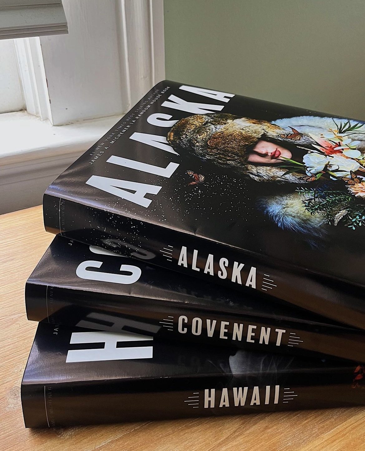
FINAL BOOK JACKET DESIGNS

FINAL PRINTS
-
![]()
Final Covers & Spines
-
![]()
paper that maintains touchability
-
![]()
Covers stacked
-
![]()
cohesive Back covers
-
![]()
Informational inner flaps
-
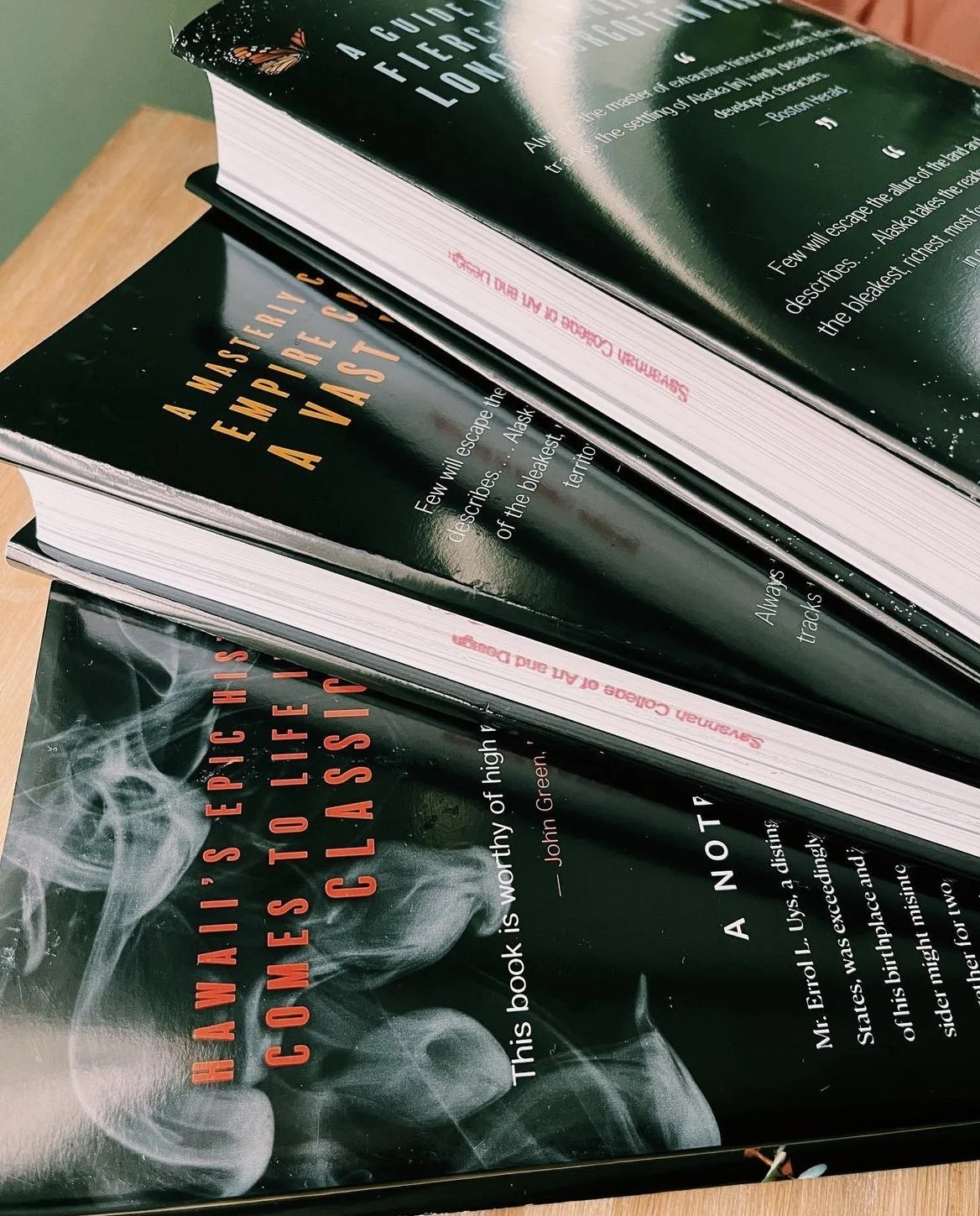
![]()
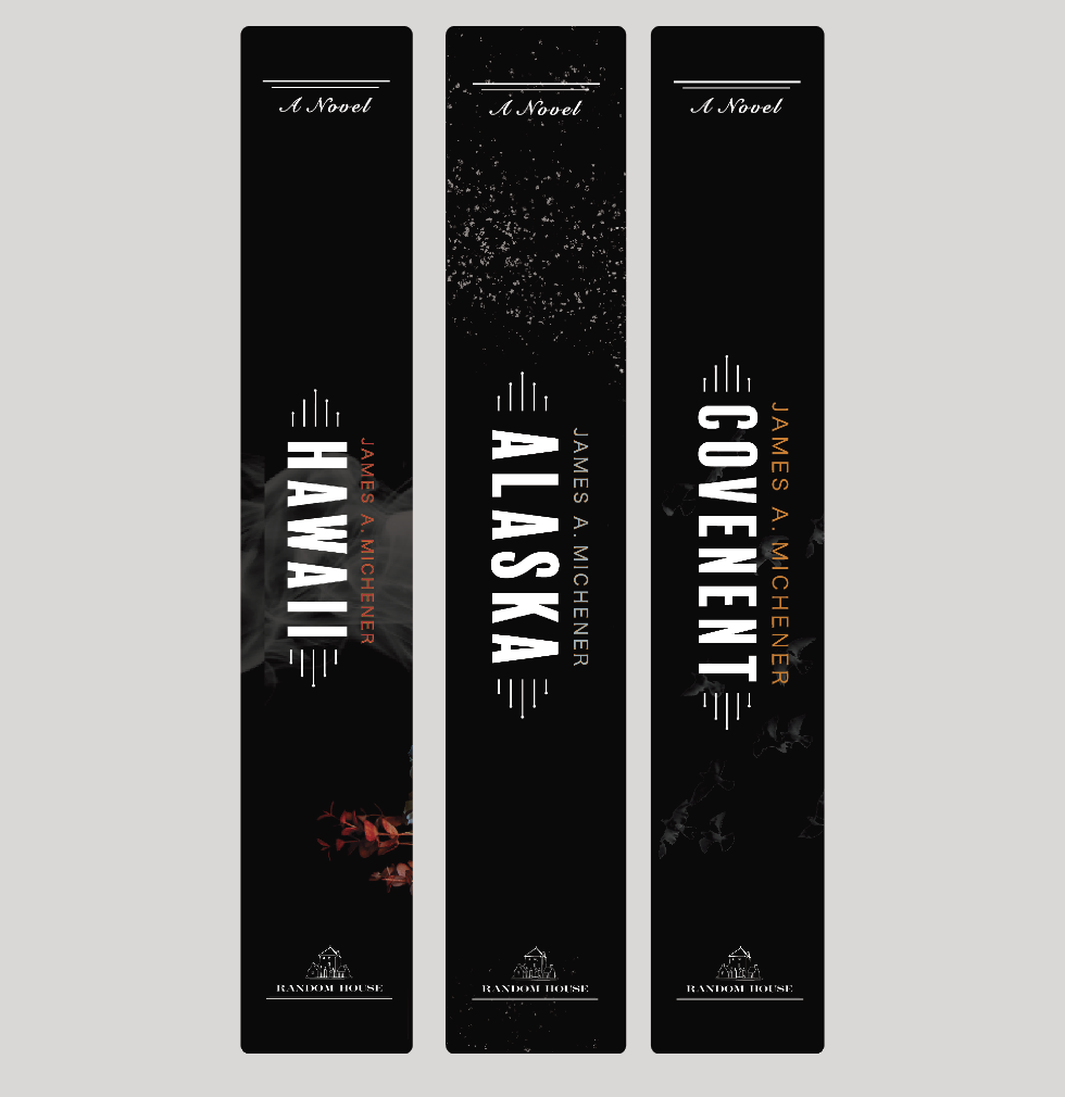
bold spines
-
![]()
Close up view


design to stand out
The final designs met my goals of being cohesive, bold, dramatic, modern, mysterious, clear, and unique. When placed within other popular books and novels, the shiny paper, bold type, uniquely crafted imagery, and striking beauty definitely stood out.

